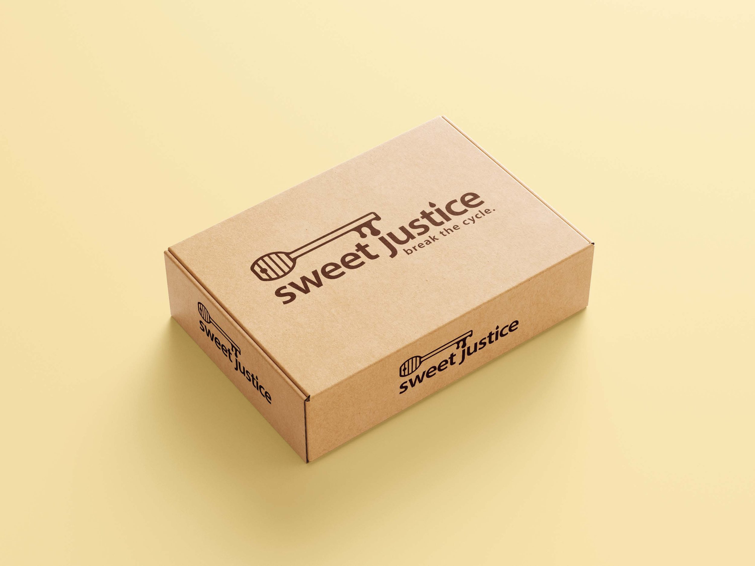
Sweet Justice
This is an industry-linked project re-branding Sweet Justice. The objective was to utilise brand development to increase retail sales, reach a wider audience and bring further compassion and awareness to their causes.
Sweet Justice is a purpose-driven startup enterprise that provides training, support, and employment for people in the justice system. It also offers pollination services to the horticulture community in Victoria, Australia, as well as honey and beeswax products to the broader community.


Concept
The Sweet Justice brand mark combines a honey wand and a key to symbolise the brand's two core pillars: high-quality honey products and the liberation, hope, and independence of individuals in the justice system.
A clean, modern sans-serif typeface enhances contemporary appeal, while warm yellow and orange tones reflect the inviting hues of honey. “Sweet” is highlighted in yellow to evoke honey’s taste, while “Justice” appears in deeper orange, balancing warmth with the gravity of the justice system. These elements convey the brand’s values of hope, perseverance, and rehabilitation. The tagline “Break the Cycle” reinforces this mission, addressing recidivism and Sweet Justice’s role in helping people rebuild their lives.
The new brand mark sets Sweet Justice apart in the honey market, positioning it as a social enterprise dedicated to hope and second chances.


